What is Marquee?
Marquee is a popular, eye-catching component used on many awwward winning websites. It allows for vertical or horizontal scrolling text. It’s even seen in real-life in examples like train stations, or other group events providing up-to-date and potentionally lengthy information.
In early web dev days, it was very popular and even had a native and widely supported HTML element: <marquee>. While the <marquee> element is no longer supported, marquee is still extremely popular and adds a now more artistic feel and interesting visual interest. There’s many ways to build it, and you can get as intense as you’d like. The level of intensity depends on what features are required.
Choosing the Right Technology
If you need a simple version that doesn’t have any user interaction, HTML and CSS will do the trick. I’ll start with this simple example to demonstrate my thoughts behind the animation. Afterwards, there will be additional tutorials were we’ll rebuild it in a more modern context (using React and Framer). And then finally, I’ll add more advanced features such as adjusting the speed while hovering.
Building the HTML
To start, let’s setup the HTML. We begin with a div as our Container. You can think of this as what is visible to the user. Within that, we have the Track. The Track is what contains our “conveyer belt” of content (more on this in the next section). Here’s an illustration to demonstrate.
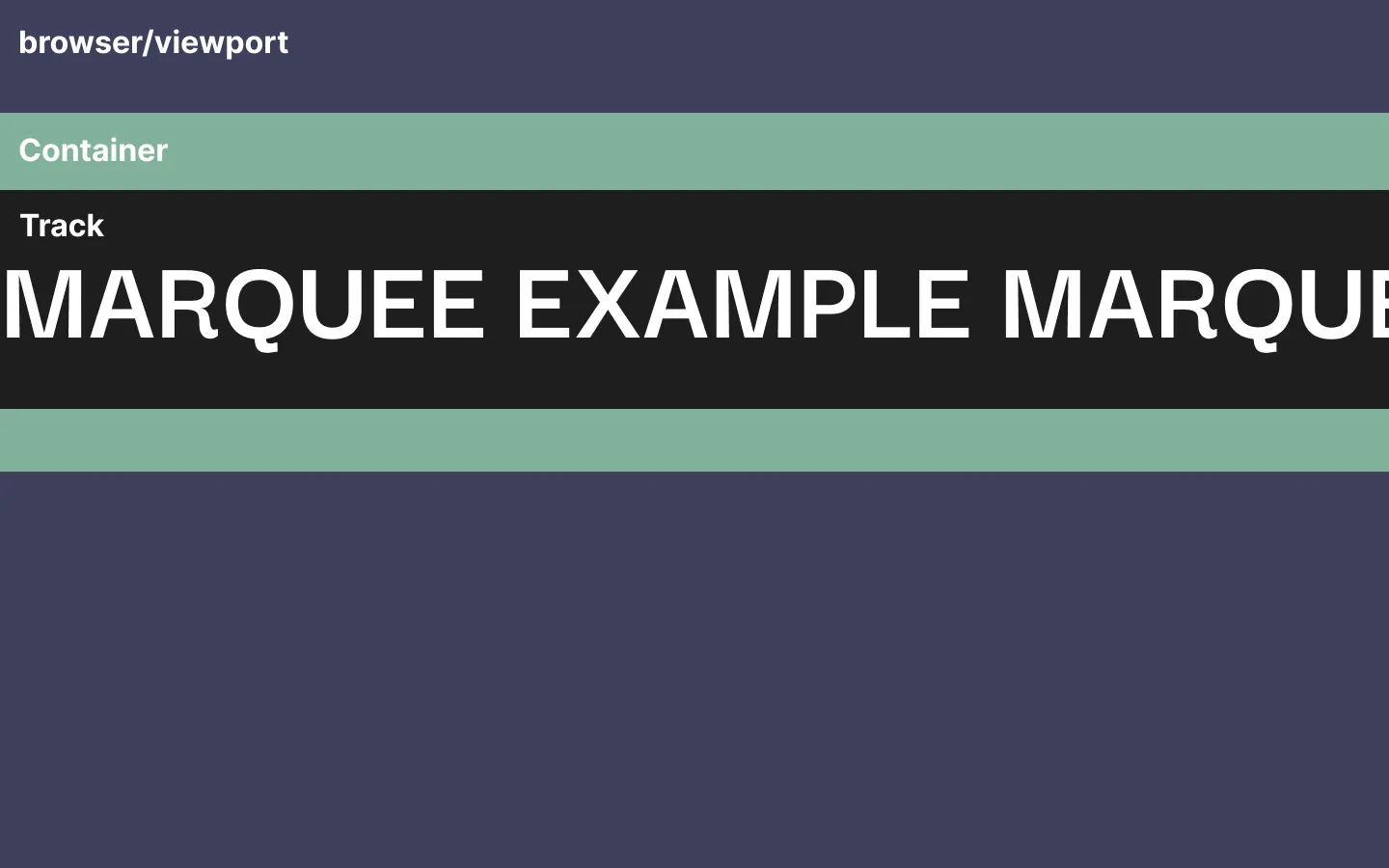
Transforming our illustration into HTML, we get:
<div class="container">
  <div class="track">
    Marquee Example
  </div>
</div>
The Animation’s Concept
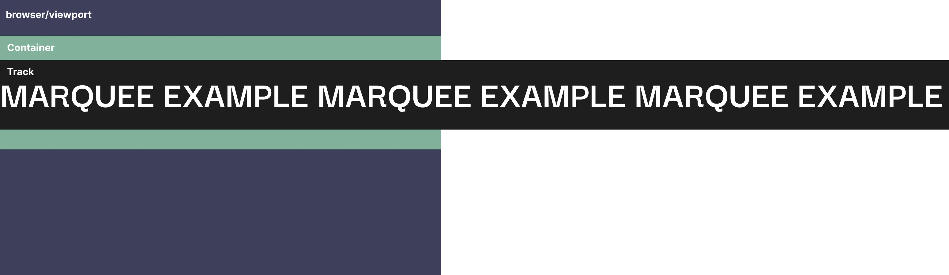
Previously, I referred to the Track as a “conveyer belt”. What I didn’t show you was the full illustration, where our Track far extends beyond what the user is able to see. It extends beyond our viewport so that we have a constant stream of content that’s available to enter into view i.e. the “conveyer belt”. And once, we animate the track 50% to the left, we restart the animation— giving us a perfect loop of “endless content”. In order to hide this extra content flowing off the screen and to not cause horizontal overflow, we use overflow: hidden on our Container. In reality, this is what our HTML looks like:
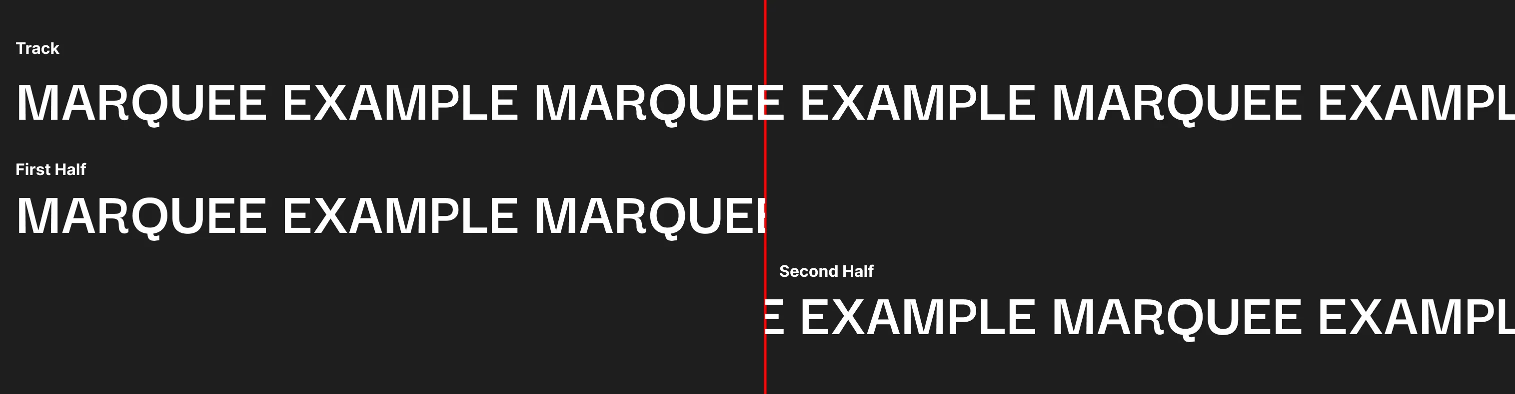
Constraint: Must Have a Center Point
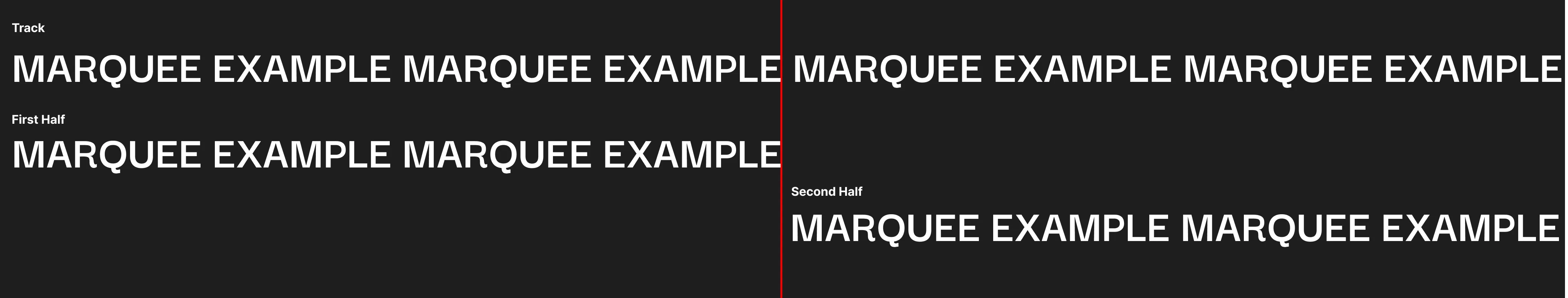
One important constraint is that our content has to have a perfect center point where each side of the center point has identical content. This is important so that when we restart the animation at 50% completion, the restart isn’t noticeable. If the center point is unbalanced in any way, the restart will cause the content to appear jumpy. In this illustration you can see the first half doesn’t match the second, so this would make the content appear jumpy.
A way we can guaruntee a center point, is by doubling the content a few times. If you double it at least once, it’s guarunteed to have a center point. Ensuring a center pointer (and that’s there’s enough content on the screen) we double the track’s content a few times.
Also, make sure to add an extra space at the end to match the space at the end of the first half using (See HTML below).
<div class="container">
<div class="track">
Marquee Example Marquee Example Marquee Example Marquee Example Marquee Example Marquee Example Marquee Example Marquee Example
</div>
</div>Setting up the Base CSS
Now that our HTML is ready, let’s set up our base CSS and validate the animation. For this, I’ll explain each portion as comments in the code.
  .container {
    background: black;

    /* Since our track is overflowing, we need to hide this to not cause horizontal scrolling. */
    overflow: hidden;
  }

  .track {
    font-size: 100px;
    color: white;

    /* We don't want this content to wrap. We want it to overflow off the screen. */
    width: max-content;

    /* This is used so that our   actually takes up space. */
    white-space: pre;

    /*
      Try adding this transform and then commenting it out. You should see that your
      HTML exactly matches with it and without it. That means everything is setup
      correctly and your animation won't be jumpy.
    */
    transform: translateX(-50%);
  }
Setting up the Animation
Now that the base CSS is setup and we tested the transform will happen seemlessly. Now we can finally add the finally animation that makes the magic happen! 🎉
 @keyframes marquee {
    from {
      transform: translateX(0%);
    }

    to {
      transform: translateX(-50%);
    }
  }

  .container {
    background: black;
    overflow: hidden;
  }

  .track {
    font-size: 100px;
    color: white;
    width: max-content;
    white-space: pre;
    animation: marquee 5s linear infinite;
  }
Optional Challenge
Congrats on finishing this tutorial! If you want to try some extra challenges, these are fun and shouldn’t take long!
- Reverse the direction so that it comes from the other side.
- Refactor the animation and styling so the text is scrolling vertically instead of horizontally.
- Extend the vertical variation to also support reverse!
Feel free to look at the demo page to see what you should expect. It includes the challenge variations as well.
Next Up: Building it with React and Framer.
Depending on your project or client, you may need to add interaction to the marquee. Some examples of this could be slowing it down (or entirely stopping it) on hover for better accessibility. Or maybe you want to allow the user to be able to drag it themselves? To help better set us up for these requirements, we’ll rebuild this simple example in React and use a library called Framer that helps manage animations.
Thanks for Reading

Keep Going
Learning web development can be tough. Resources are scattered, guides are outdated, and projects are dull. My journey involved dedicated research, especially through passion projects like these. I hope collaborating on these projects strengthens your skills and sparks your own creativity!